
Studio Mirae
Studio Mirae is a women-led, boutique interior design studio founded by Soni Mehra, built on deep cultural curiosity and a profound respect for craftsmanship. Seeking to create bespoke spaces through a modern lens of heritage, the atelier envisions homes that reflect not just taste, but truth.
At its heart, Studio Mirae sought to tell its clients’ stories— through spaces that carried memory, balanced form with function, encouraged creative exploration and, above all, reflected identity with honesty.
Client
Studio Mirae
Services
Brand Strategy / Brand Identity
Homes that speak of your world as you’ve lived it.
Spaces with mere decorative appeal began to lose significance, earning value only when they held roots. In an increasingly multicultural world, people sought homes that held not just beauty, but meaning, rooted in lived experience.
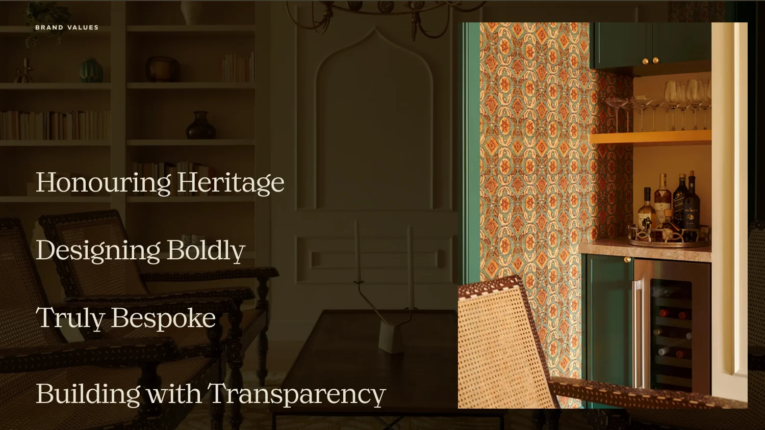
Studio Mirae filled this white space beautifully. Supportive, instinctively artistic and deeply curious, its personality was defined by sophistication, sincerity and excitement— being authentic without ever being pretentious.
Our positioning statement took shape naturally, setting the stage for where the brand wanted to be, and where it was headed.
To craft bold, bespoke interiors reflecting the client’s identity, heritage and truth.
The name: profession made personal.
The element of ‘reflection’ is what shaped the brand’s name as it stands today— ‘Mirae’, a stylised take on the word ‘mirror’. Instantly, this encapsulated the persona of the brand, while implying a space that mirrored the true reflection of its inhabitants.
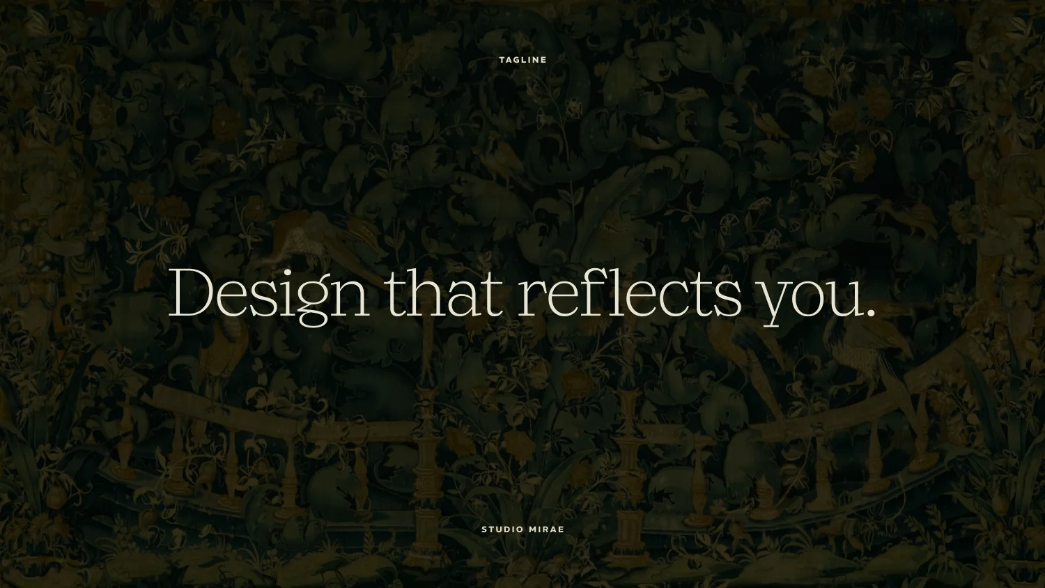
From this emerged an equally resonant promise that went on to become our tagline:
Design that reflects you.
Holding up the mirror.
Studio Mirae’s visual identity became a physical manifestation of its philosophy, balancing structural precision with a human, artistic touch.
A craftsman’s seal.
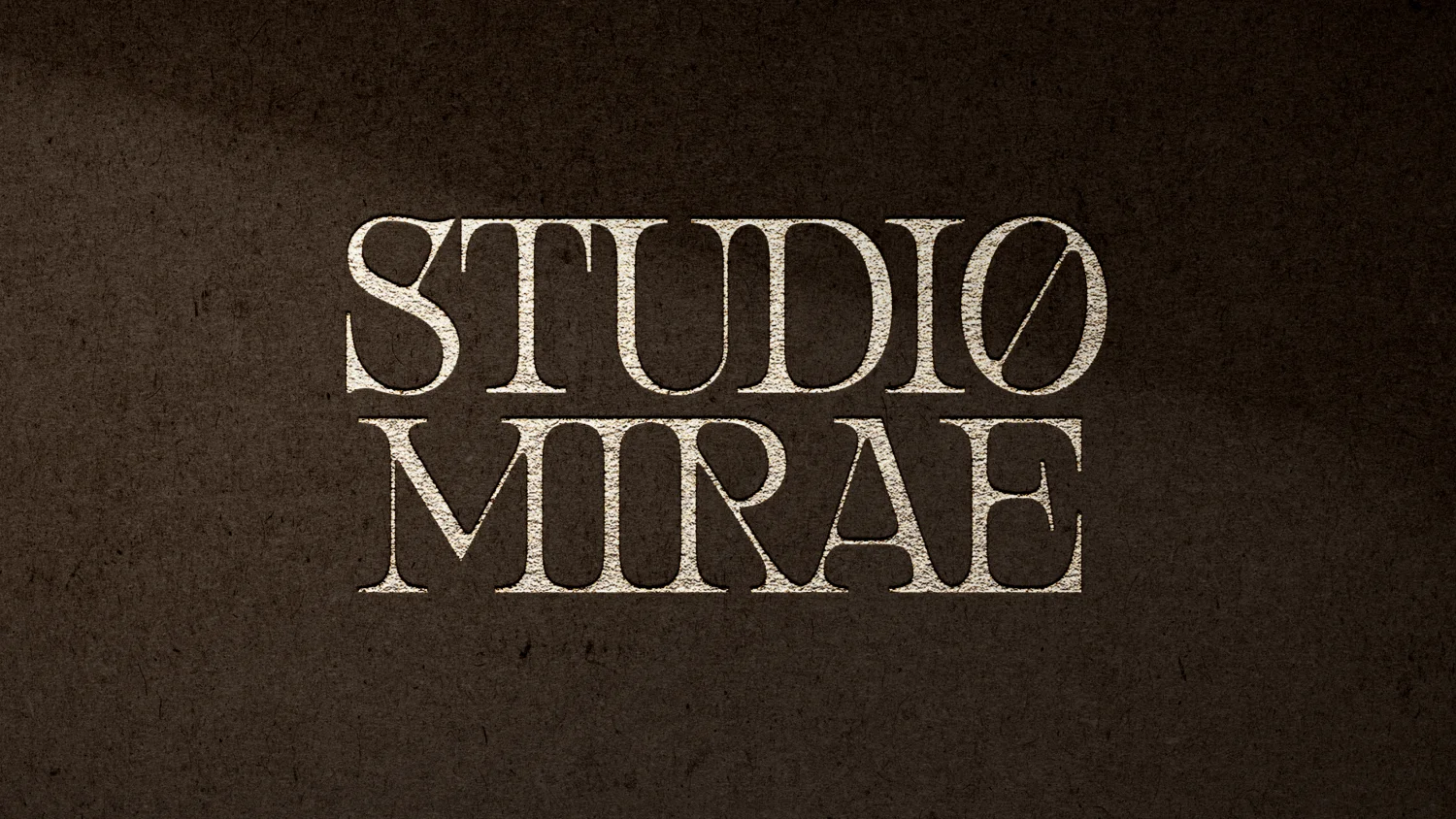
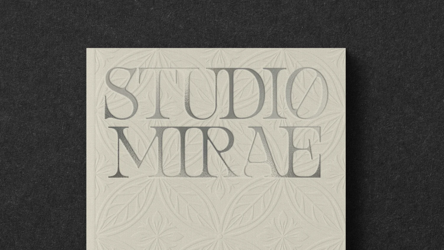
Rendered in a sculptural, high-contrast serif typeface, the wordmark conveyed deliberate poise and architectural detail.
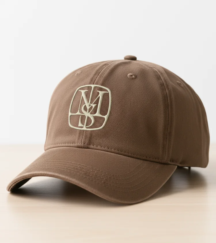
This evolved into a monogram intertwining the letters ‘S’ and ‘M’, designed to resemble a craftsman’s seal—timeless, heirloom-like and rooted in artistry.
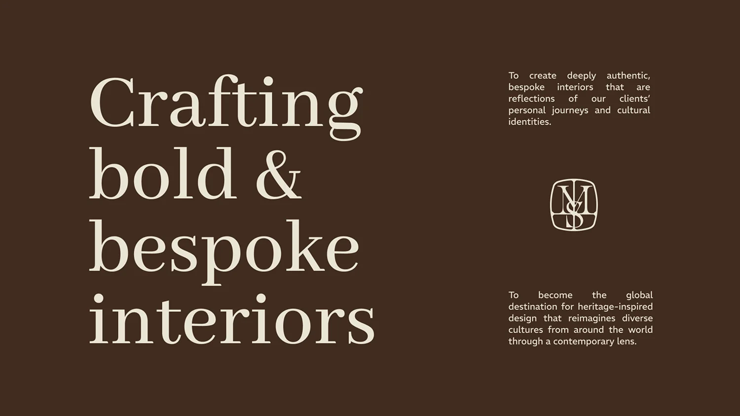
Our typography further extended this mood with Abhaya Libre’s editorial character and REM’s structural clarity, creating a visual system that balanced elegance with functionality.
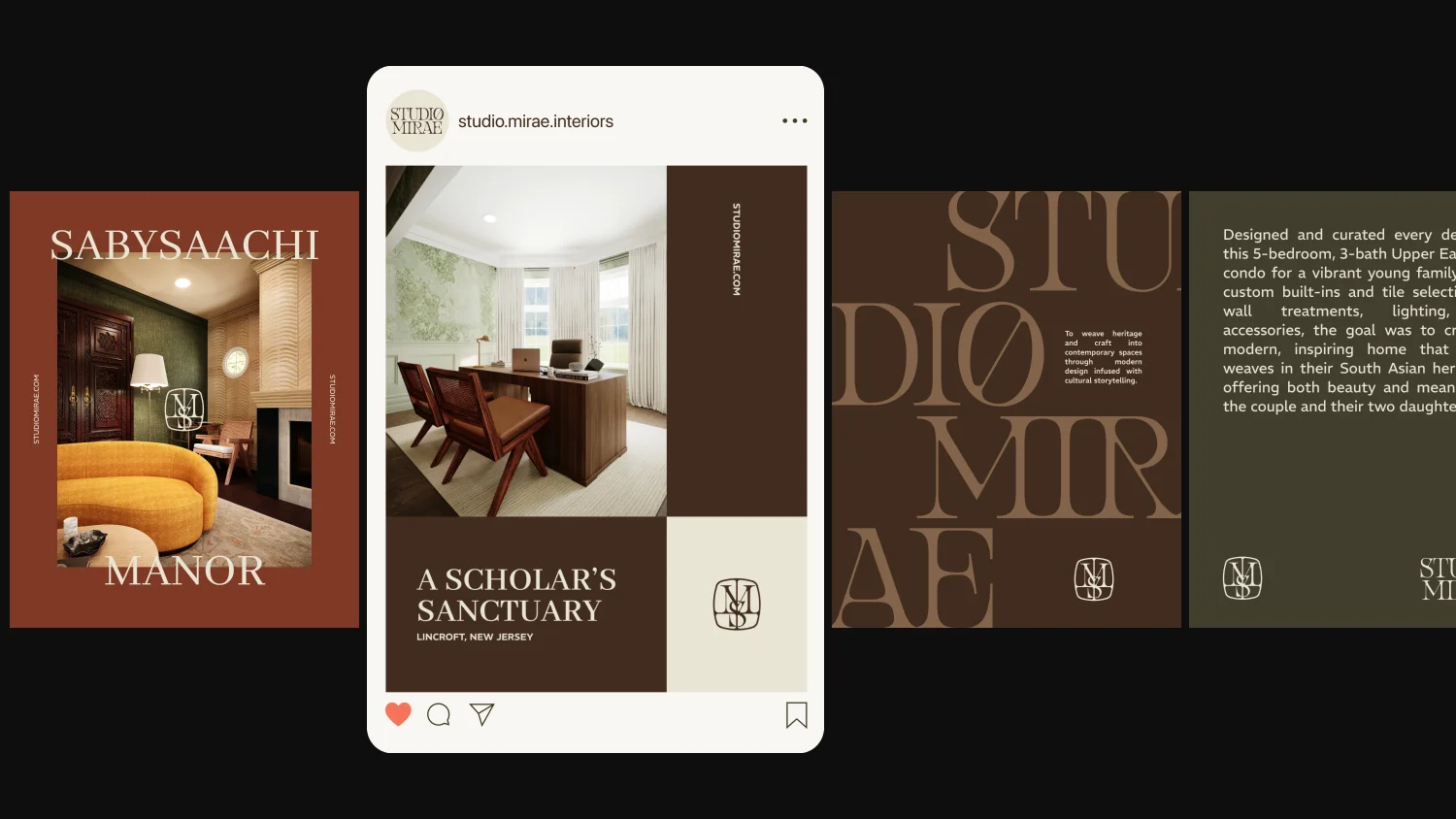
On colour: antiquity with charisma.
A palette anchored in Antique White and Dark Brown formed the brand’s foundation, complemented by an expressive colour catalog that leaned into Studio Mirae’s charm.
On the whole, Studio Mirae’s visual identity bridged heritage and modern luxury— positioning the brand as a studio that didn’t just design rooms, but reflected the stories of people living in them.
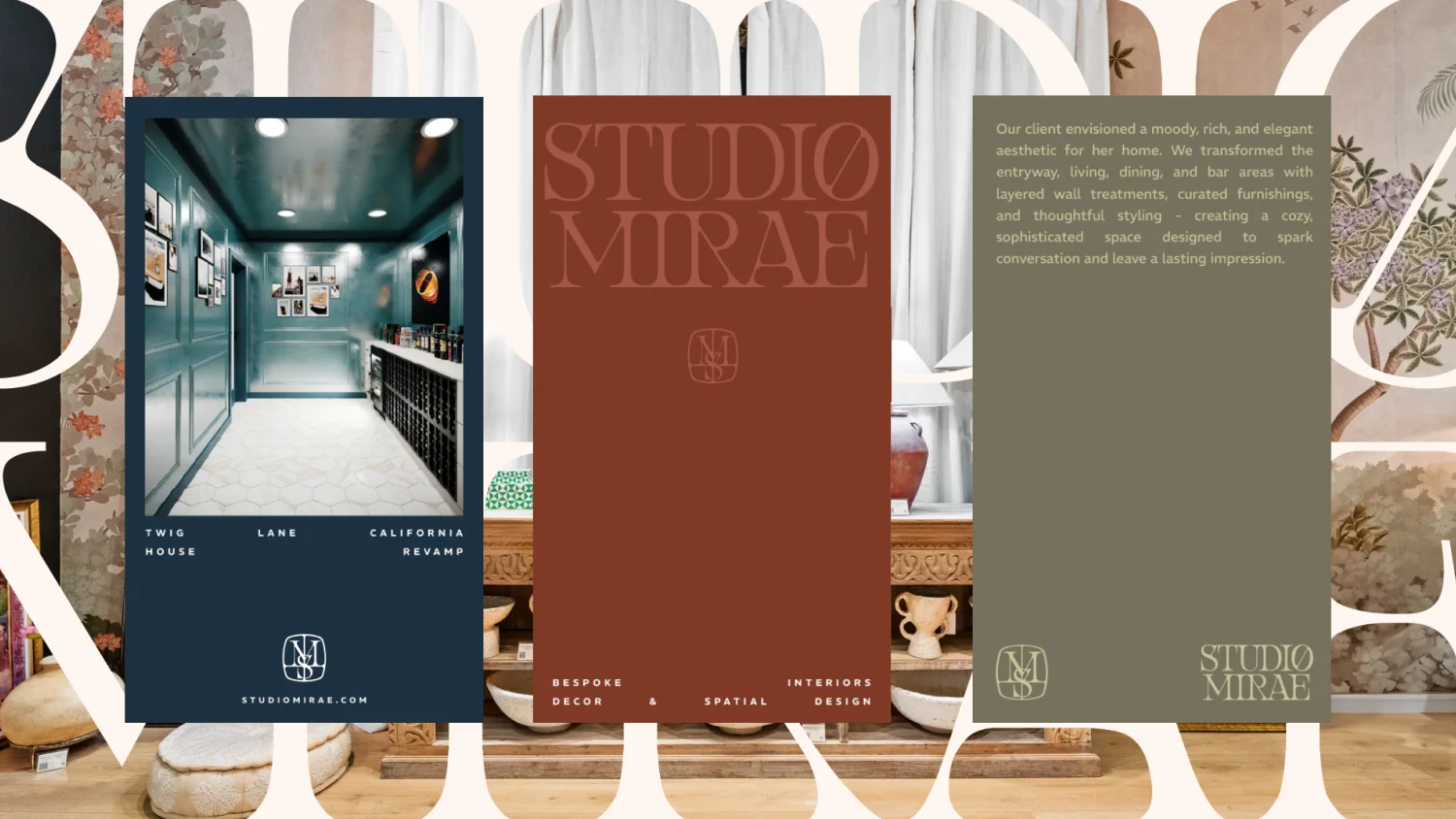
Making the vision come to life.
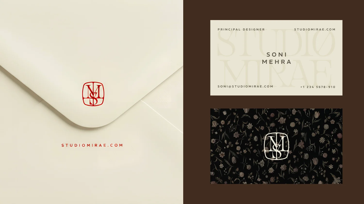
The identity extended across tactile touchpoints including envelopes, business cards, letterheads, tote bags, t-shirts and caps— with minimal design and thoughtful, plush detailing breathing life into the brand.
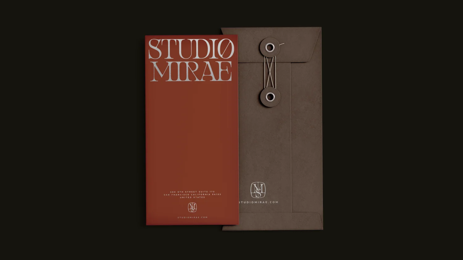
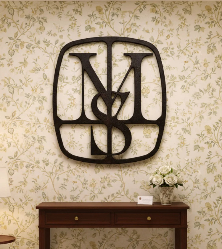
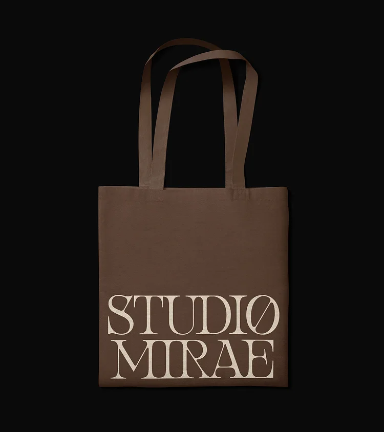
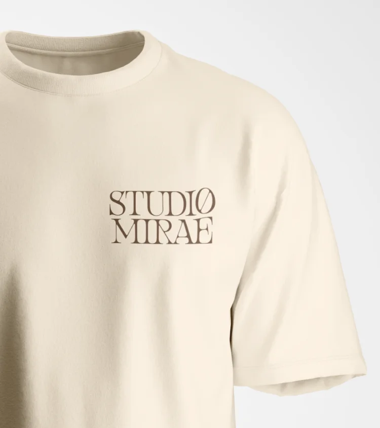
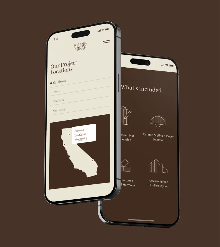
To bring Studio Mirae’s philosophy into the digital realm, we crafted an immersive website experience rooted in storytelling and interaction. From a custom logo animation to intuitive navigation, every element reflected the studio’s artistic sensibilities and craftsmanship.
The experience seamlessly unfolded the studio’s ethos and work, allowing visitors to understand its point of view and see how philosophy translated into space.
The result
Studio Mirae’s sophisticated voice and understated visual language were infused with cultural richness and playful curiosity, brought to life through a palette unafraid of colour and character.
This brought about a studio that felt exactly right for its time— worldly wise, culturally resonant, artistic and endlessly curious.
Interested in working together?