
Brand Identity System for Myntra
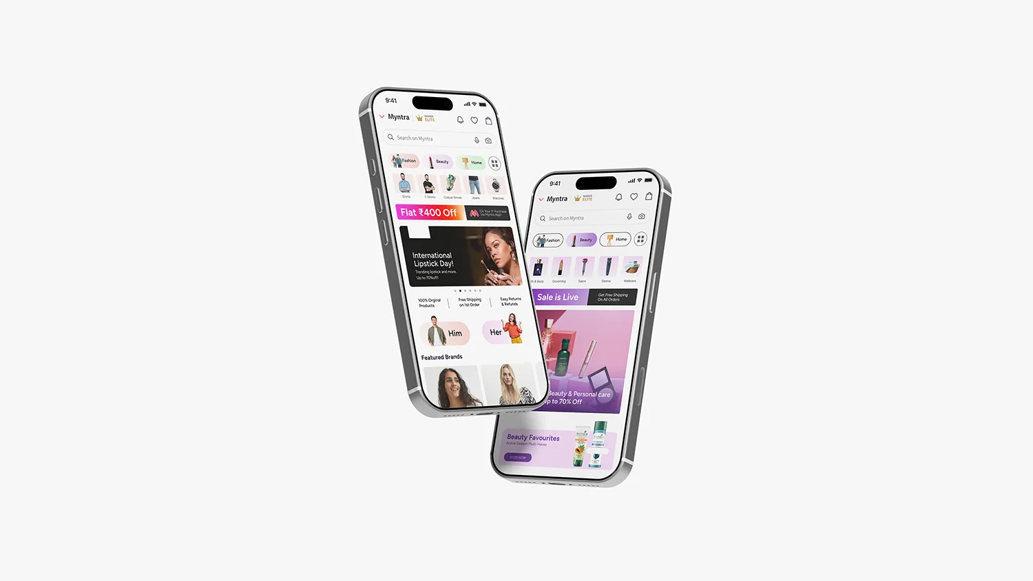
Myntra engaged us to develop a cohesive brand identity system for them. With a portfolio spanning across fashion, home & beauty, the existing visual language lacked structural consistency and a unifying framework. Our objective was to establish a system that is prescriptive and scalable, yet retains sufficient flexibility for major seasonal campaigns to express a distinct character of their own.
Client
Myntra
Services
Brand Identity / UI/UX
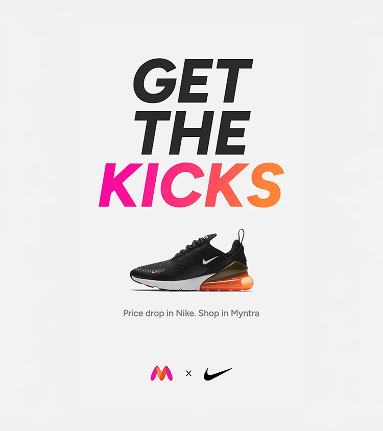

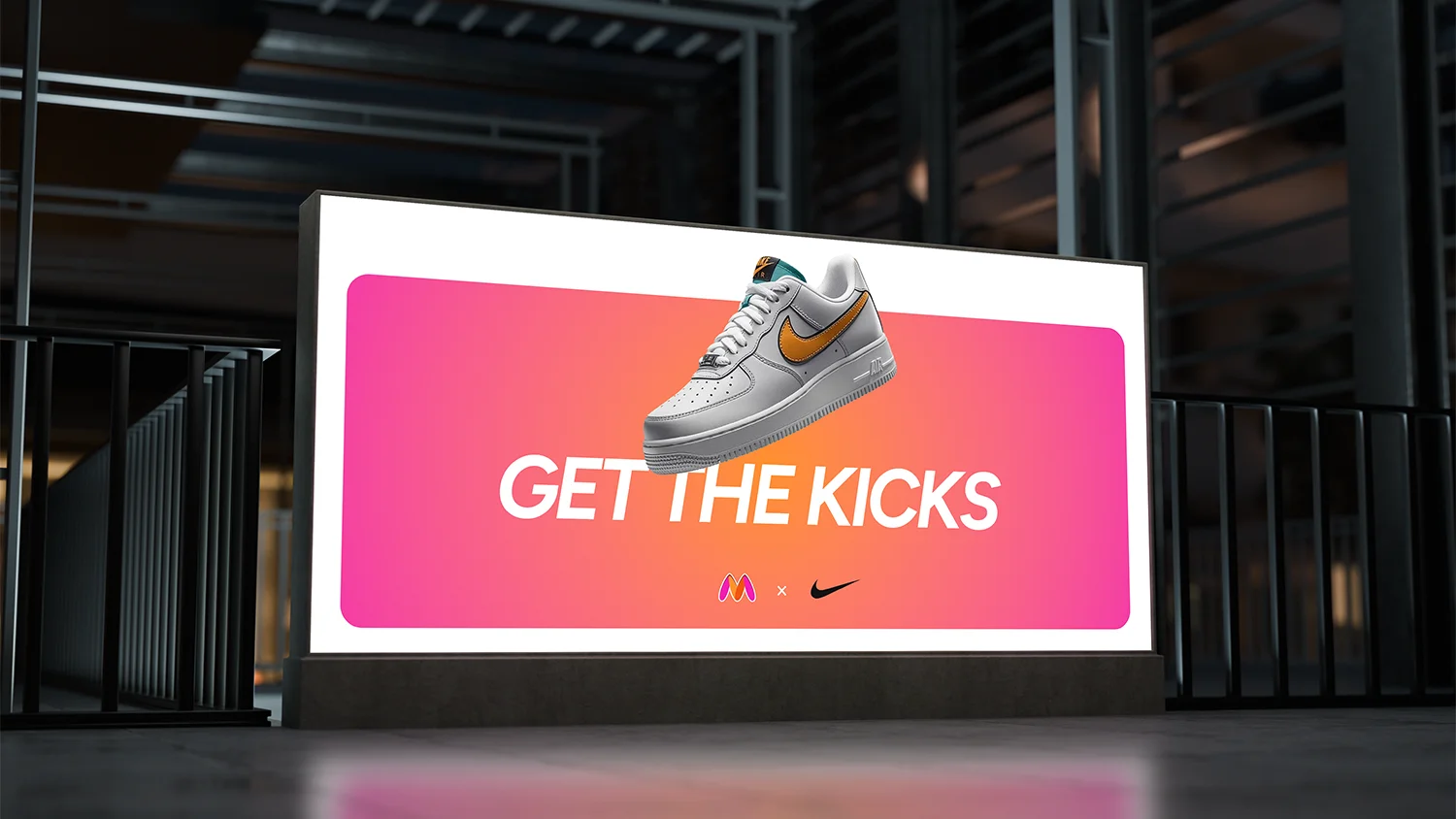
It became apparent early in the process that colour would need to carry a dual responsibility: affording sufficient freedom for diversity across creatives, while remaining codified enough to signal each individual category.
We began by establishing a saturated core palette for the masterbrand, derived from the saturated orange and pink of the existing logo. This was subsequently extended through a structured range of tints and shades, broadening the palette.
The colours were then developed into a suite of gradients: single-tone gradients that lend depth and dimension while holding a category's identity intact, and multi-tone gradients that draw across the wider palette to signal the breadth of the masterbrand.
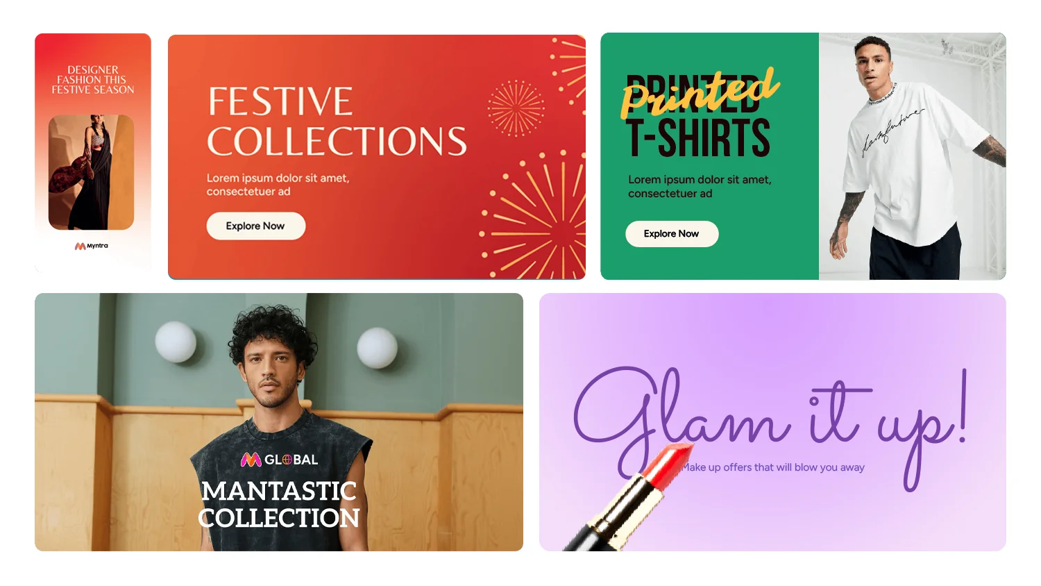
Figtree was selected as the brand typeface, its geometric construction lending a fashion-forward character while performing consistently across both headlines and text. Variation is introduced through graphic treatments such faux 3D, shadows and inlines applied to the type itself.
Where expressiveness was required, as with festivals and seasonal events, a suite of auxiliary typefaces extends the system with Figtree serving as the body type.
Interested in working together?