Bill360
For the rebranding of Bill360, a company that simplifies payment management, we focused on creating a design system that reflects its seamless and user-friendly approach.
Client
Bill360
Services
Motion, Film & Photography / Brand Identity
Bill360 is an AR automation solution tailored for small and medium-sized businesses to streamline payment processes and enhance efficiency. As a brand that prioritises its customers, we created an identity that embodies reliability and commitment.
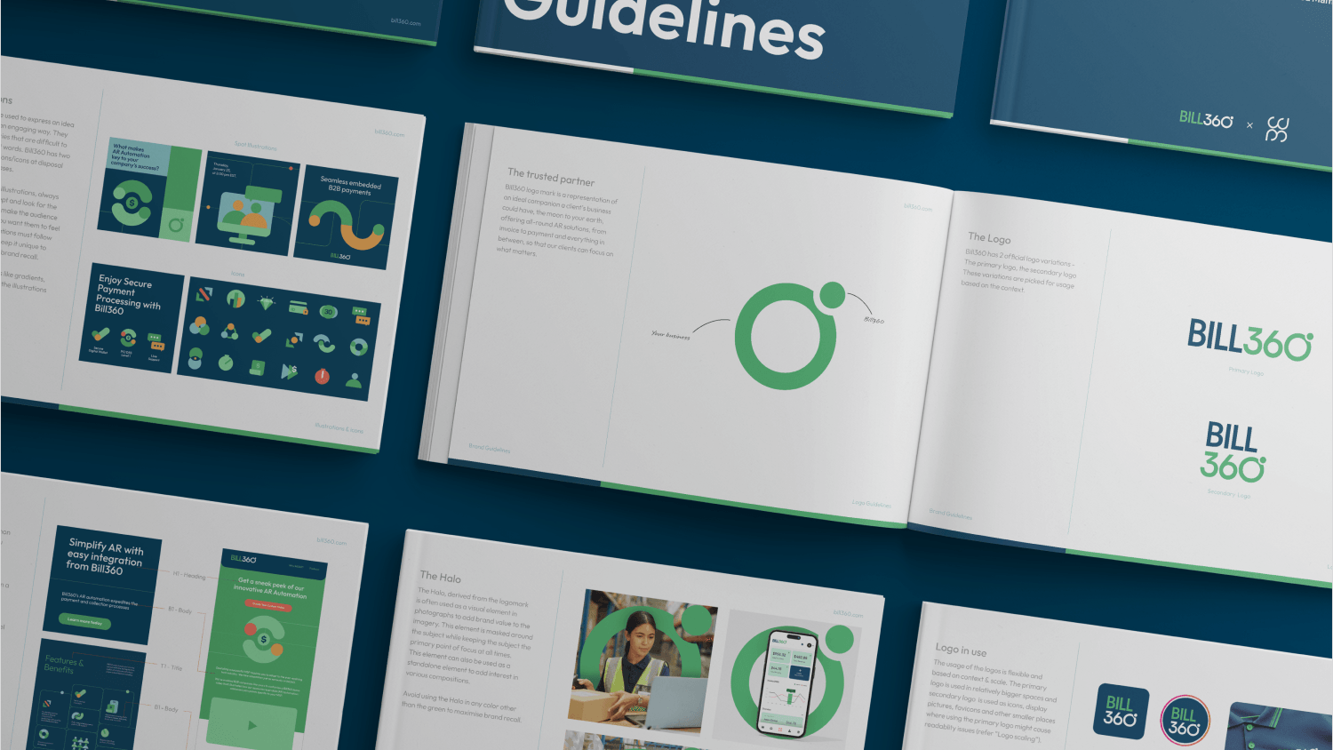
The new Bill360 logomark symbolises the ideal business companion—like the moon to the earth. We brought this concept to life in the design of the “360°," where the zero represents the earth and the degree symbol represents the moon orbiting around it.
We incorporated illustrations and icons across channels to create a more engaging visual language, using them to convey complex ideas that words alone cannot capture. Minimal yet effective, these maintain clarity while staying true to the brand’s goal of simplification.
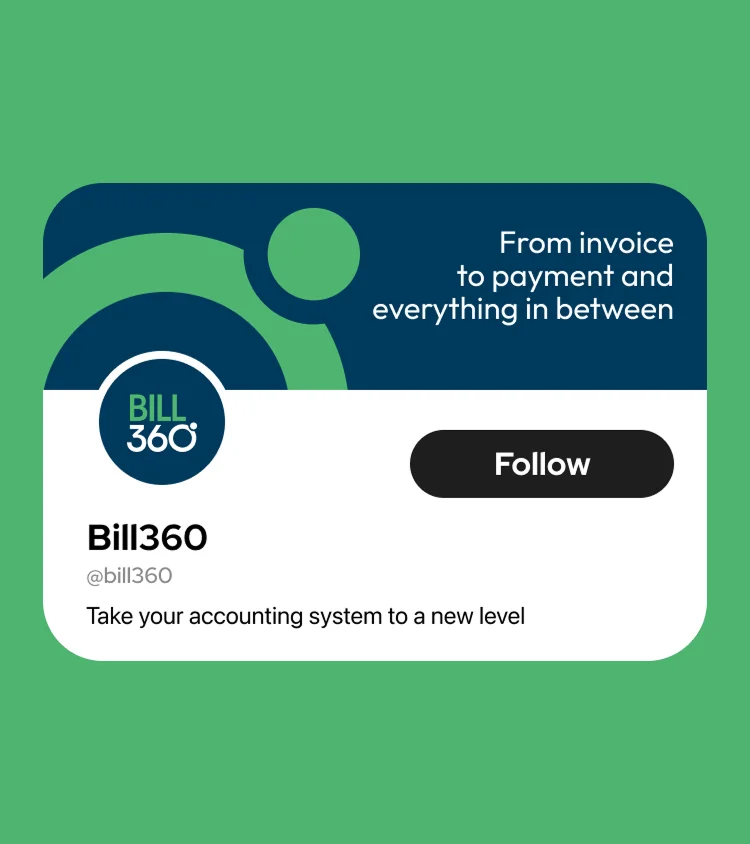

Consistency across all brand touchpoints is essential for recognition. To reinforce Bill360’s identity, we introduced the halo—a visual element that can be integrated into photographs to enhance brand value and create cohesive communication.
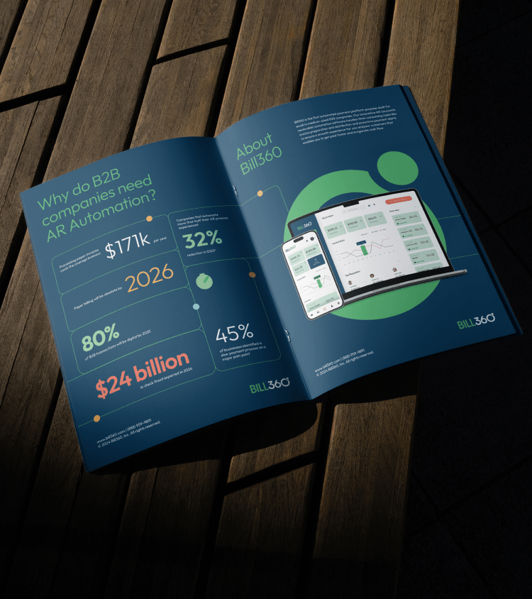
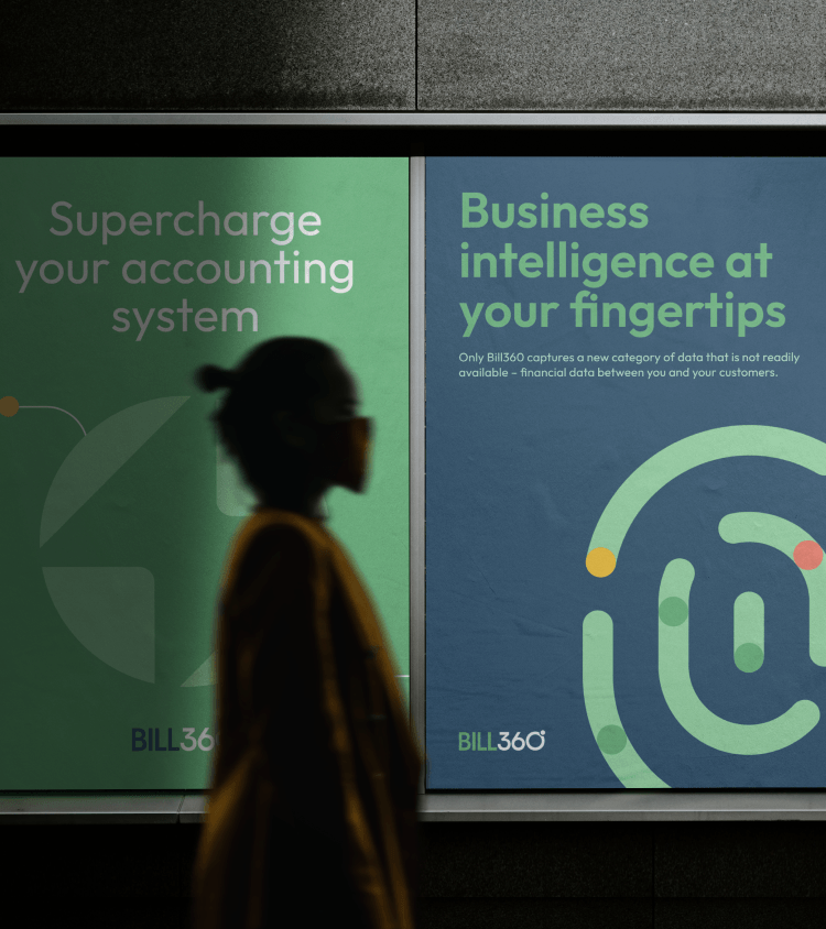
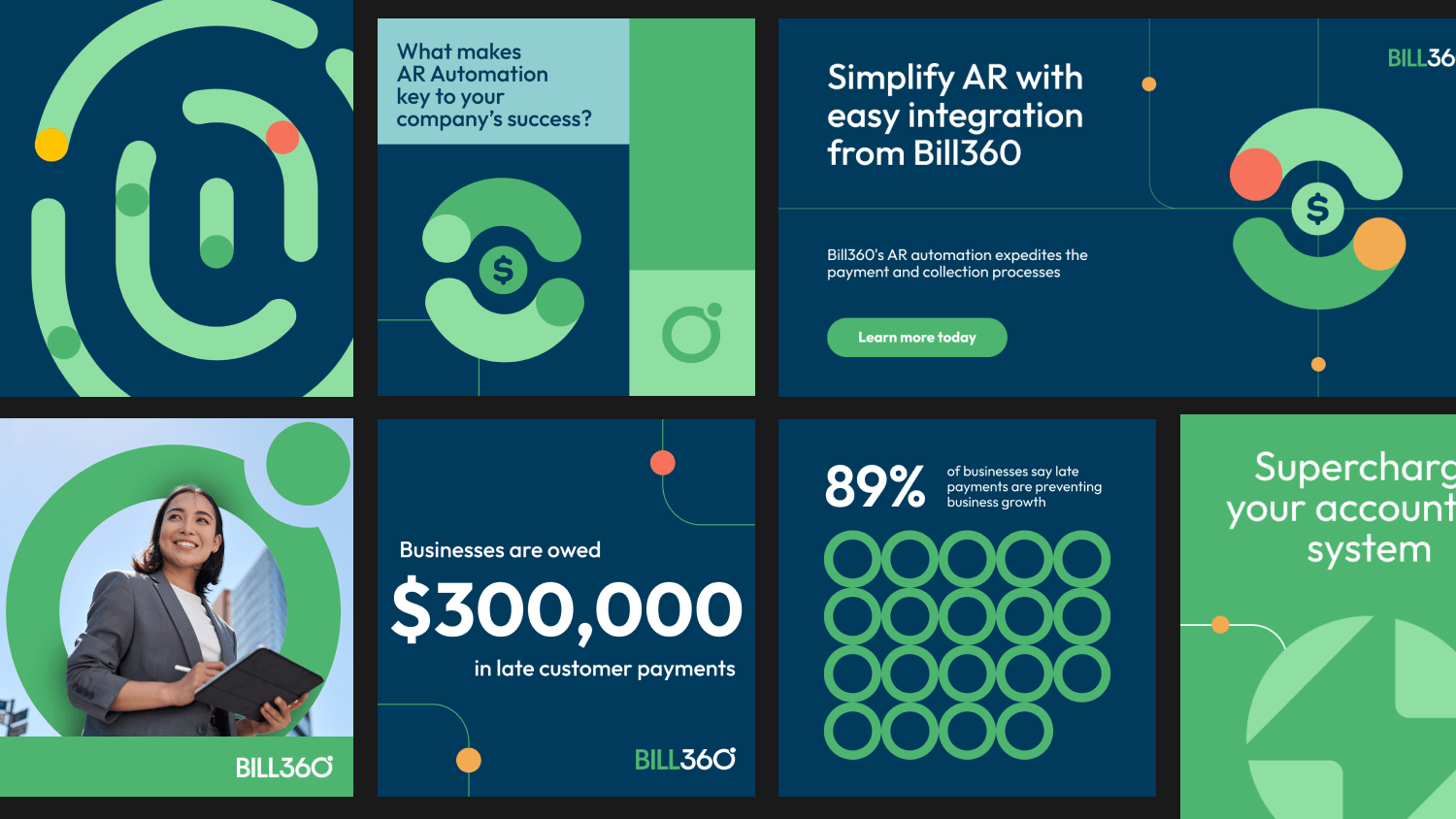
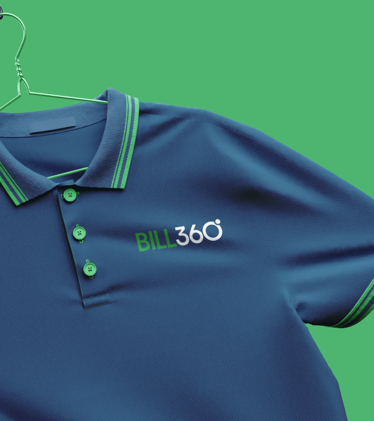
Every touchpoint, from marketing collaterals to branded merchandise like t-shirts and visiting cards, was designed to ensure a cohesive and recognizable brand presence.

Interested in working together?