Zolvit
Zolvit, formerly known as Vakilsearch, is a digital platform that connects enterprises and individuals with professionals, on-demand. With Zolvit, businesses can seek legal, business, financial and/or consultancy services and connect with licensed professionals in just a few minutes.
Client
Zolvit
Services
Brand Identity / Digital Experiences
Tasked with a comprehensive rebrand, our mandate was to develop a modern and functional visual identity that worked in conjunction with, and complemented the wide variety of services offered by Zolvit. After developing a visual language, we were commissioned to create Zolvit’s website. To achieve these goals, we employed a two-phase approach;
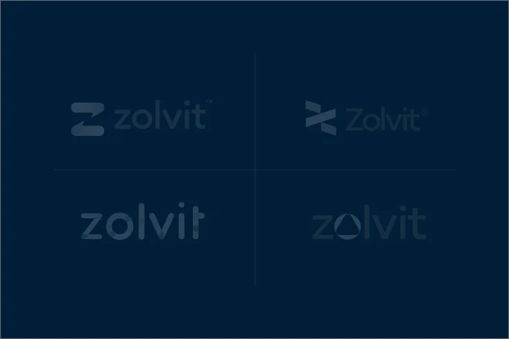

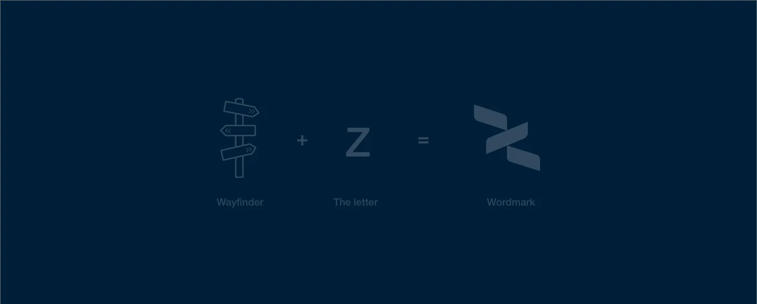
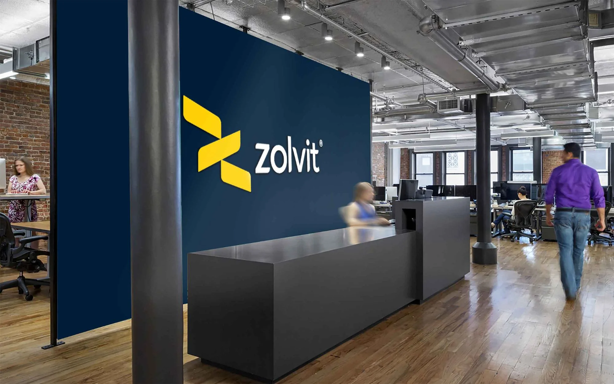
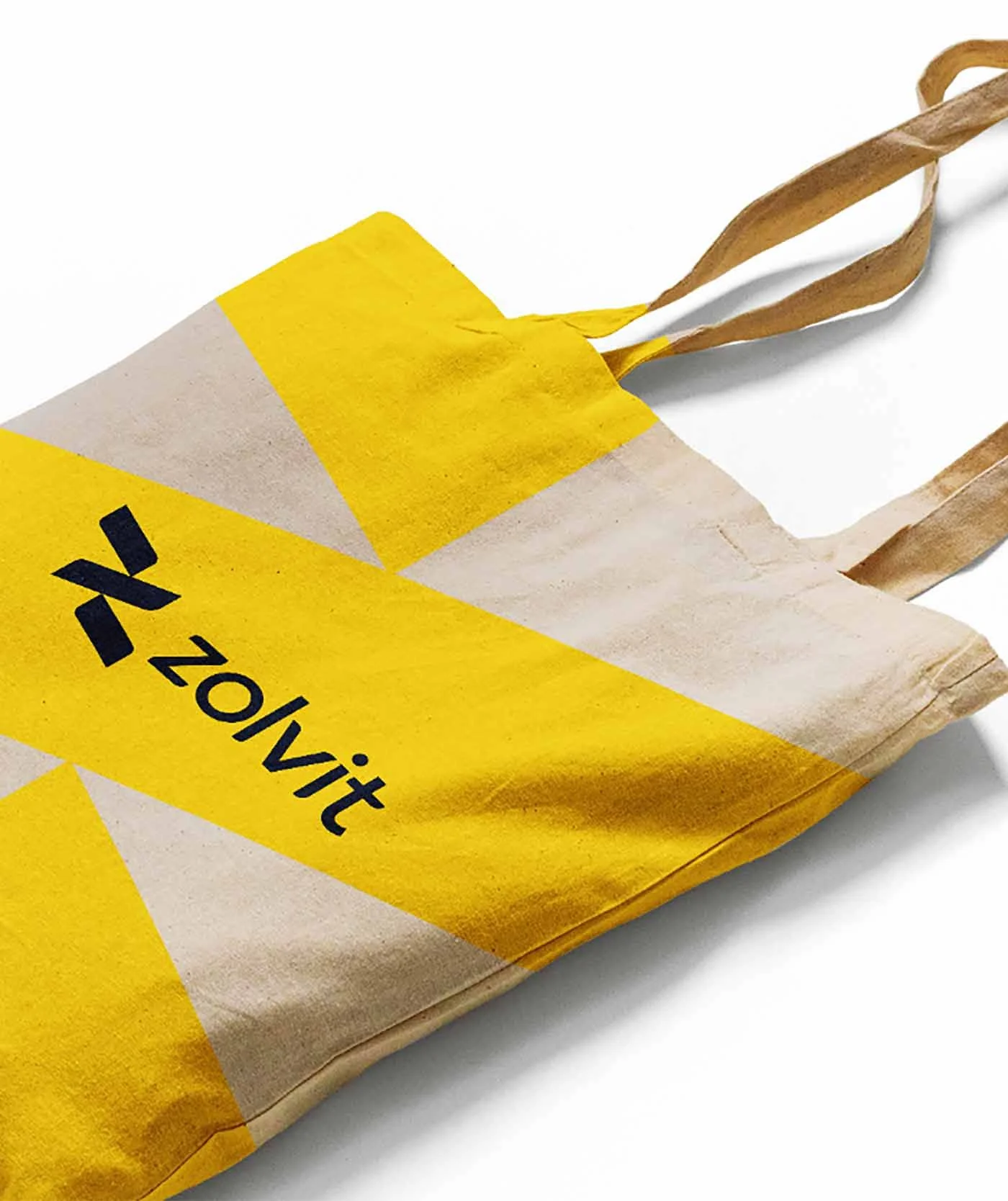
Emuluating the company’s name, the logo was designed to work as an individual element, i.e the ‘Z’, as well as a combined wordmark.
Apart from aesthetics, the application and functionality of such a logo was a significant consideration
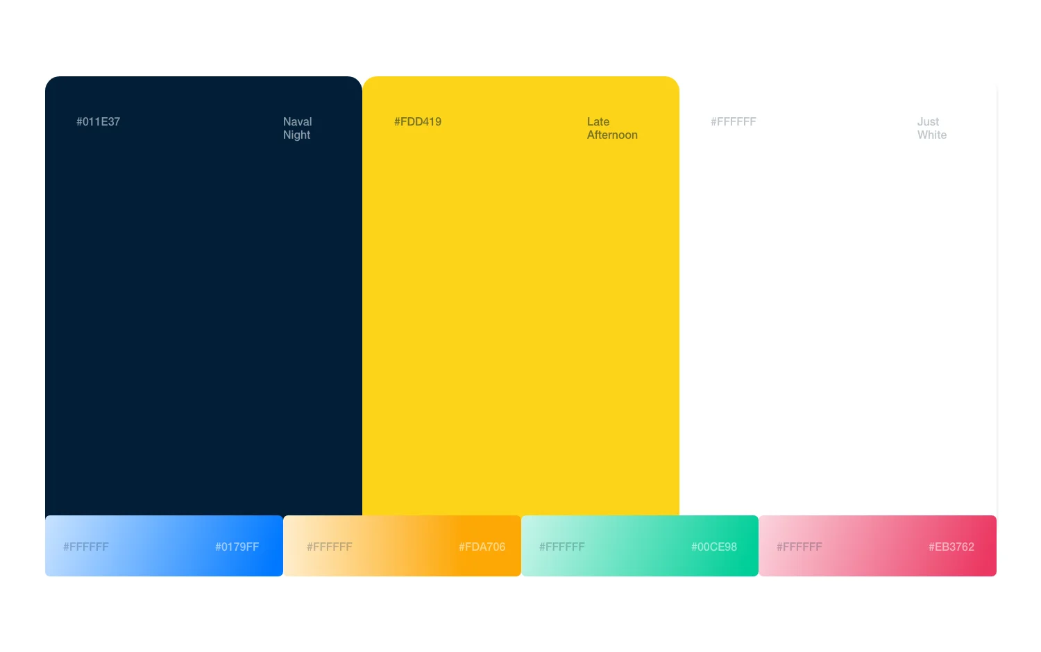
Using Vakilsearch’s colours as a starting point, we built a visual identity that complemented the brand’s rebrand, paying homage to where it came from, while also giving it a modern aesthetic


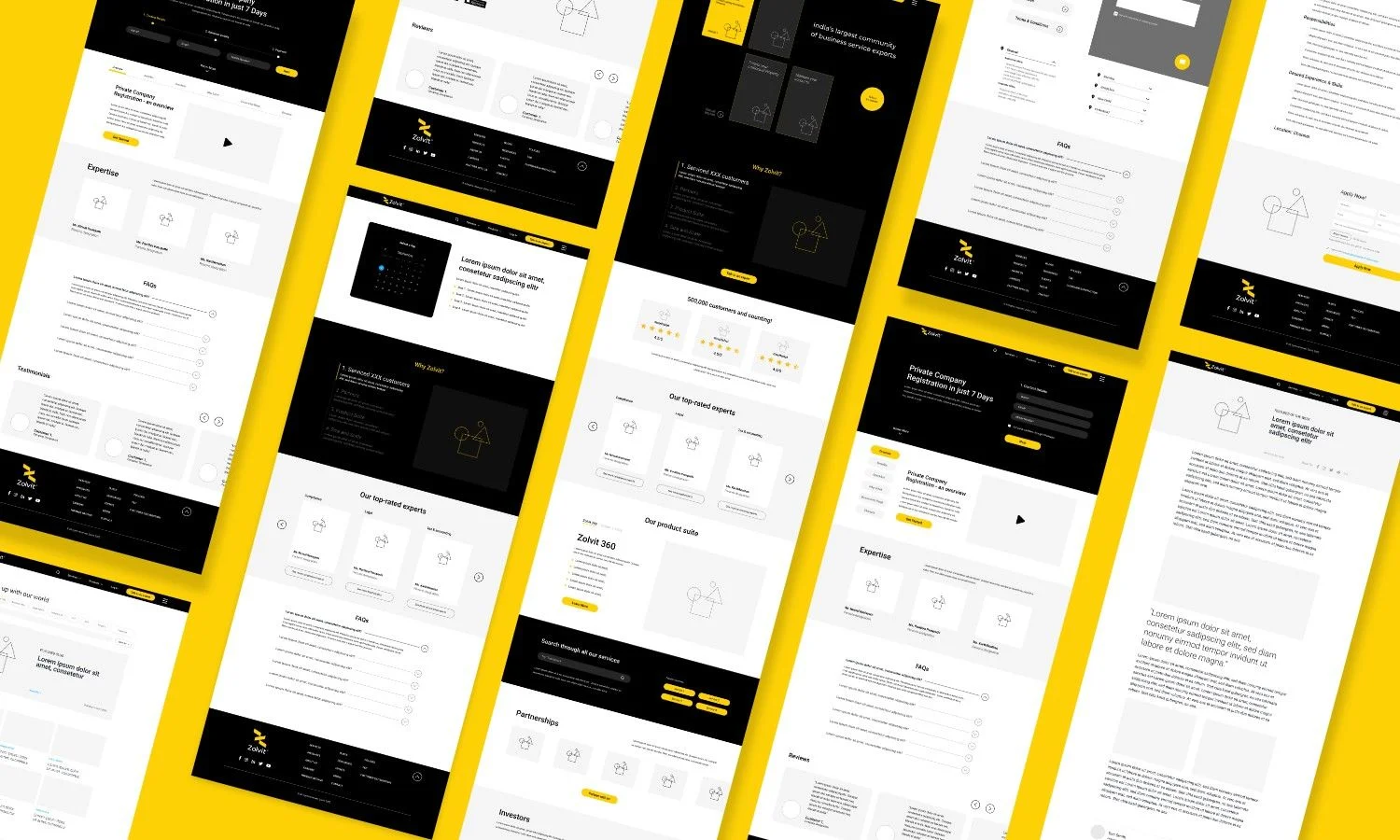
We embarked on Phase 2 with a comprehensive look into the services offered by Zolvit, as well as user behaviour on the platform, both on mobile and web.
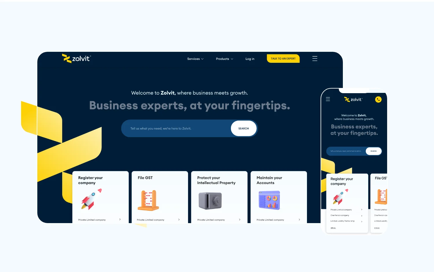
This entailed creating a wireframe that gave us a 360-degree overview of the entirety of the design process, as well as the various elements and functionalities of the website.
With Zolvit’s aesthetic in mind, our goal was to make the entirety of the user experience seamless – This began with navigation across Zolvit’s different products and services.
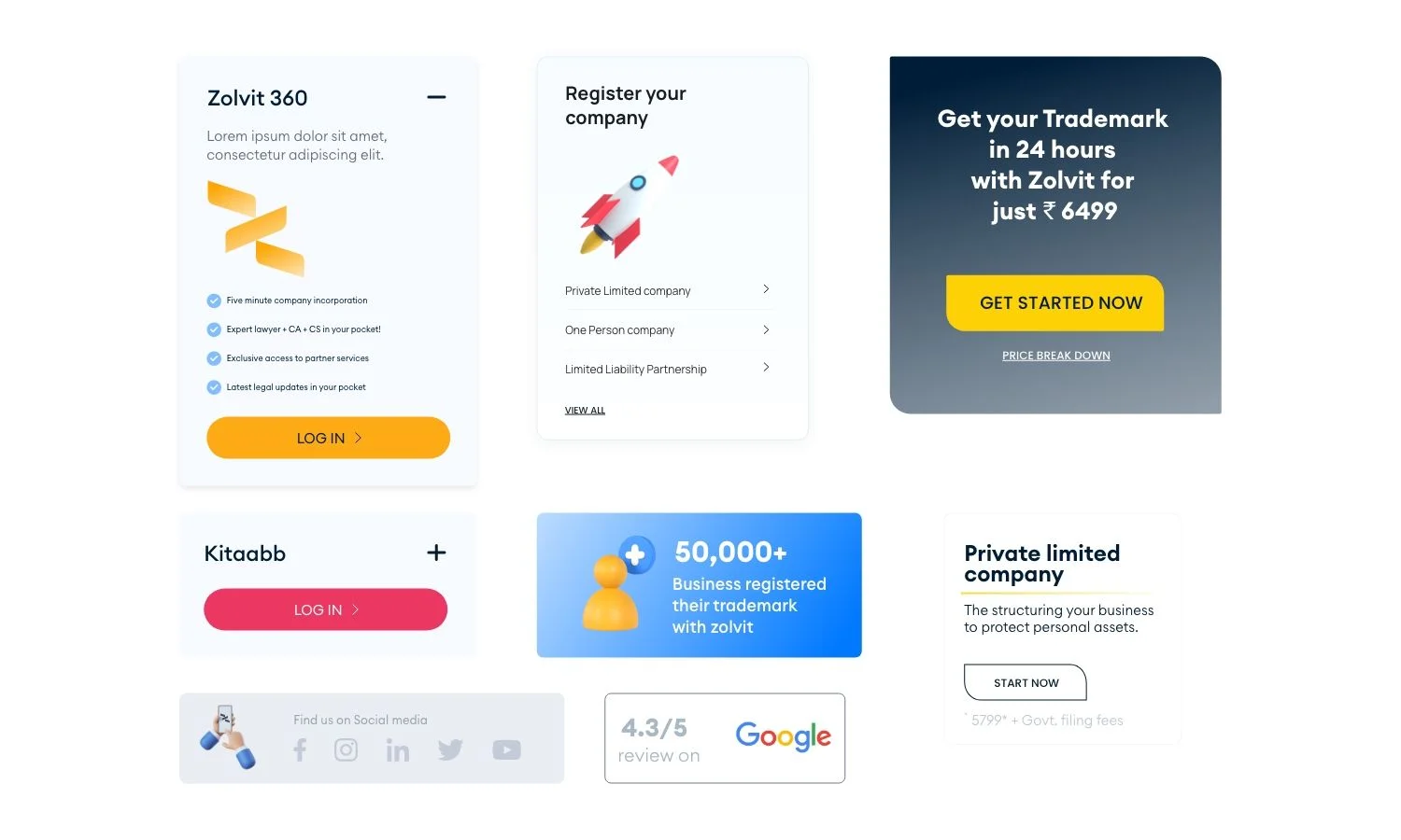
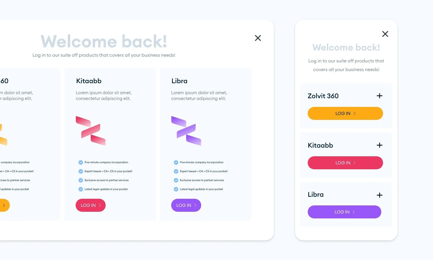
Our UI/UX made discovering, learning and purchasing the company’s products simple and direct, making it one of the central elements of the homepage, as well as the website as a whole.
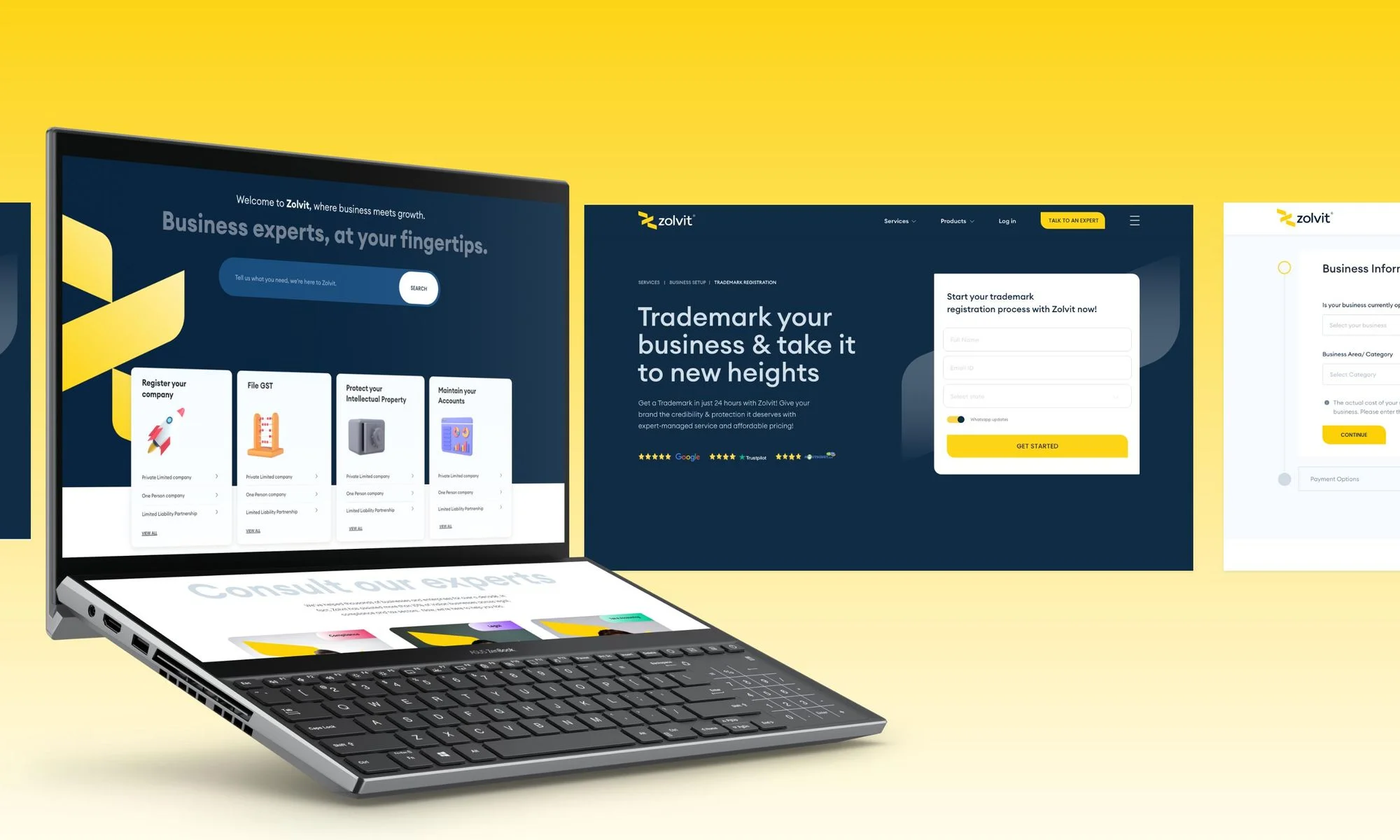
Given the company’s complex and wide variety of services, our UI/UX approach was centered around simplifying the process of navigation, making sure the user could quickly find the desired product and/or service.
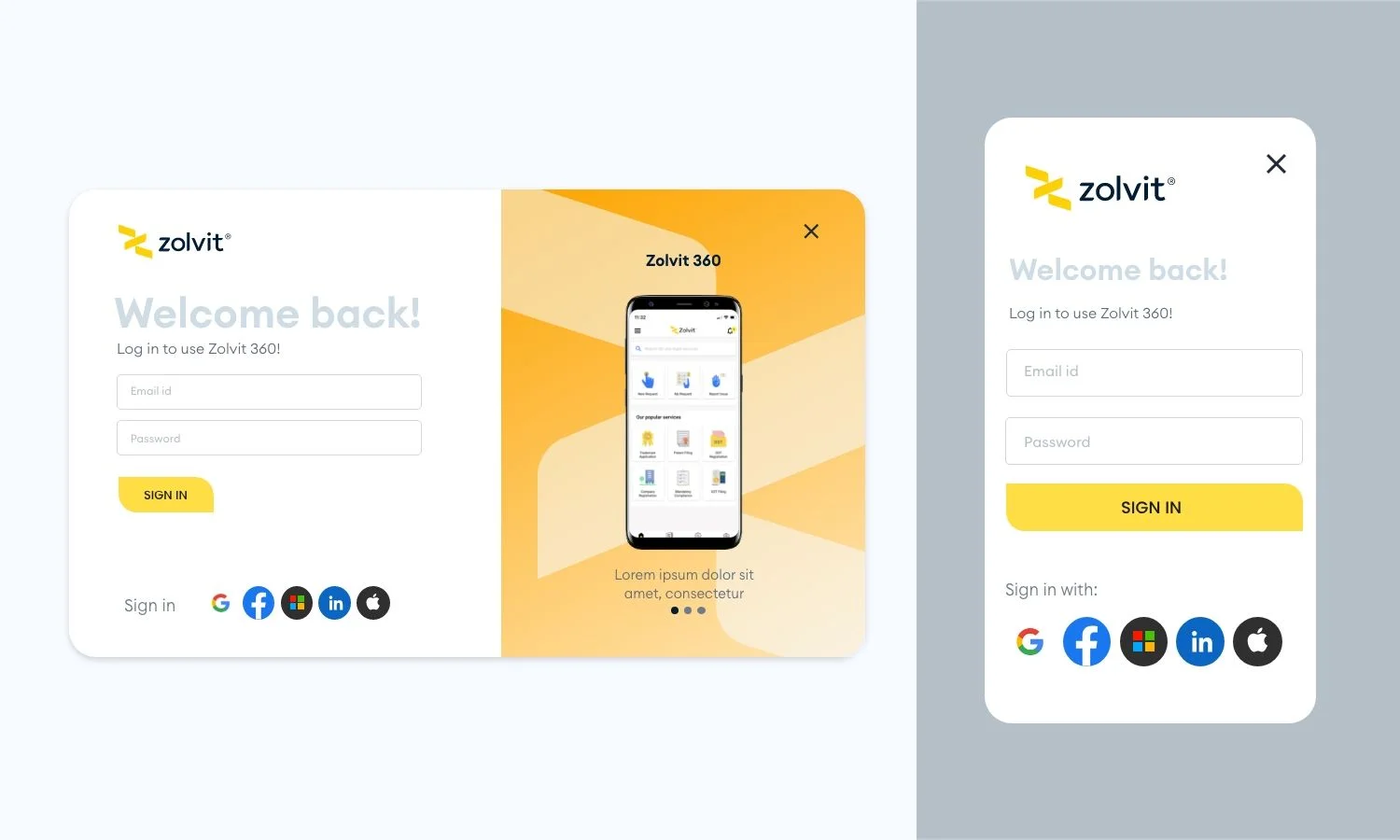
To that end, we integrated a menu that intuitively contained all of the company’s services, while also making facilities for breadcrumb pages that would contribute to recall. As a whole, this led to a much more succinct user experience.

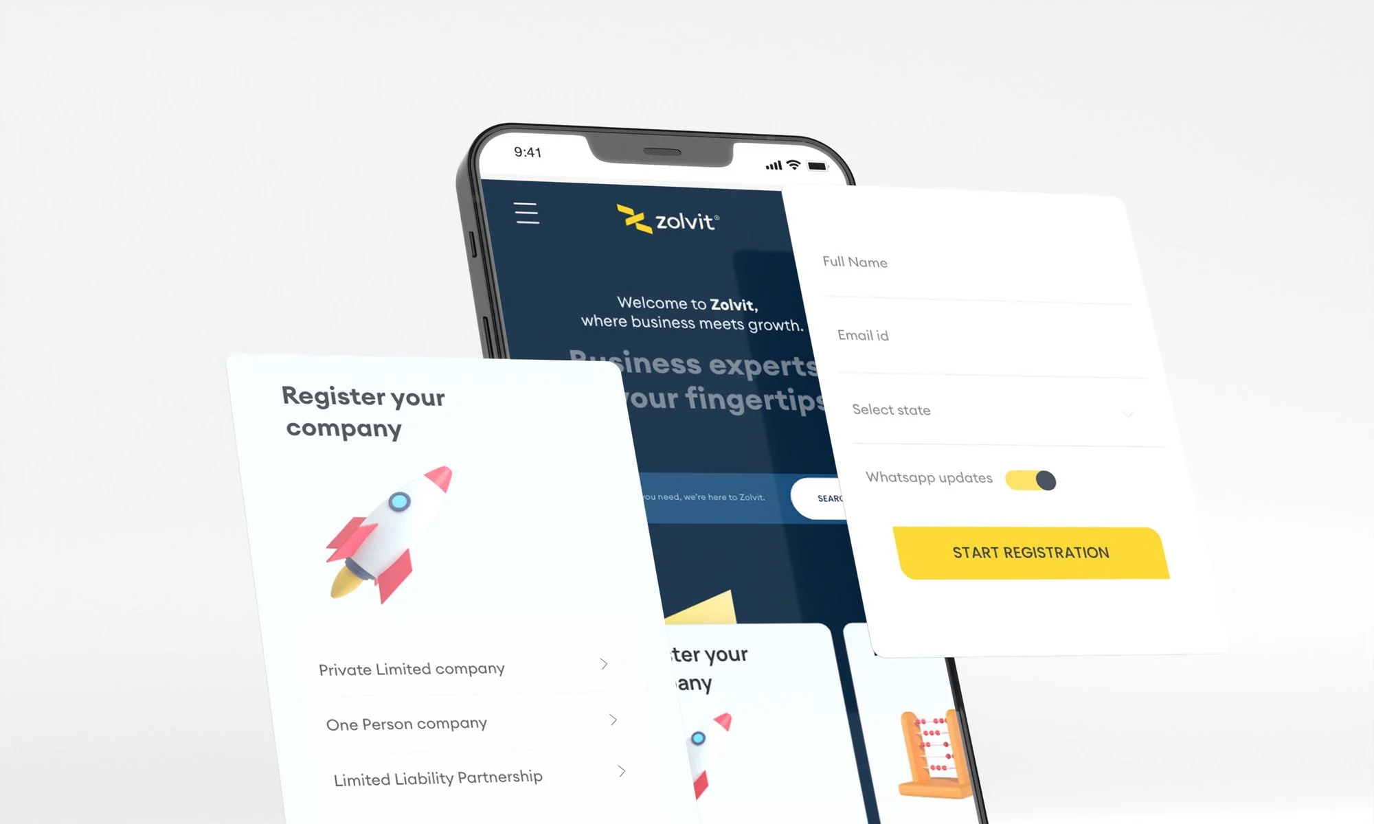
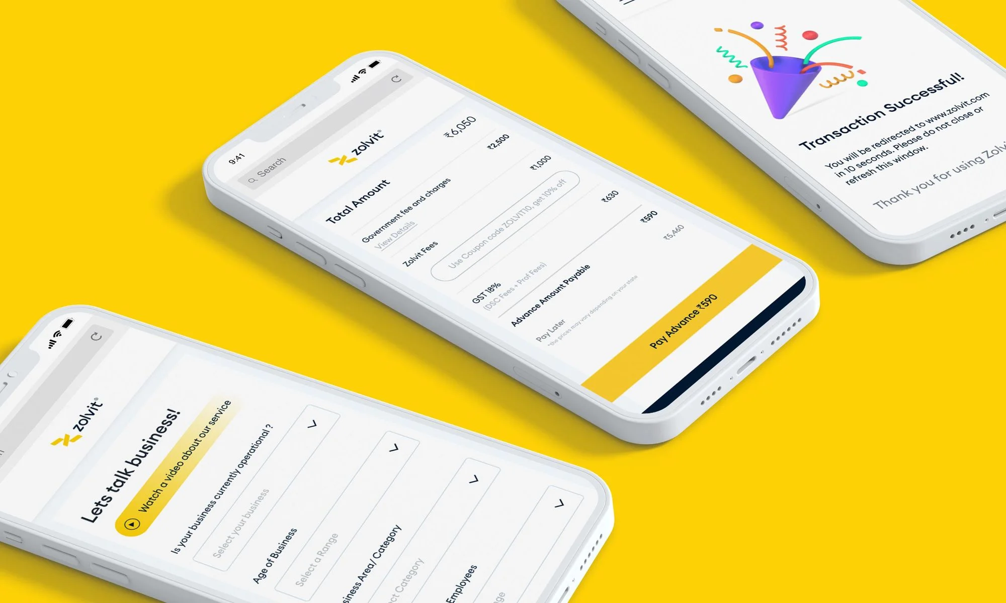
On mobile, making navigation quicker was a central challenge, and one we addressed with simplicity over sophistication.
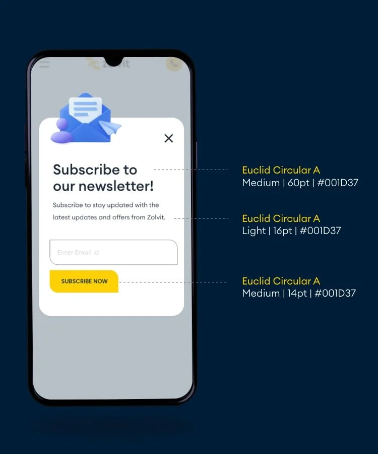

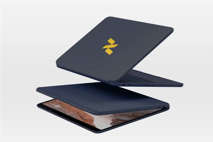
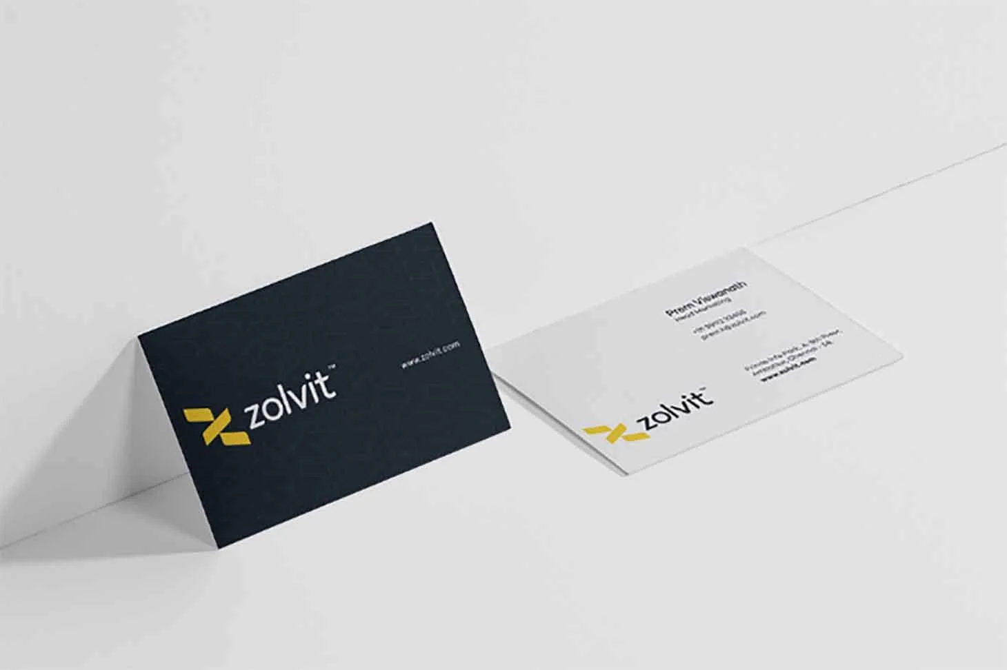
After the structure of both the desktop and mobile pages were set in stone, we added the finishing touches by incorporating various brand-building elements across the website
Interested in working together?