Part Time Saints
Client
Part Time Saints
Services
Brand Strategy / Brand Identity
A rebrand that refused to follow the rules.
When the team behind EcoRight, a sustainable lifestyle and accessory brand designing eco-conscious bags, apparel and everyday essentials, approached us, the brief was simple: rebrand the company.
But as we began to unpack the story and the beliefs of the brand, it became clear that the idea had potential to evolve. Sometimes a strong story just needs to be told better. What began as a rebranding exercise soon turned into the creation of a standalone brand.
Consumer Research: Reading the room.
Before building the brand, we took a step back. We mapped the category, studied competitors and spoke directly with the people most likely to buy from the brand. Two personas emerged as the brand’s strongest drivers.
The Hip Teen & The Working Grad.
The category insight? The gap between sustainability and great design was wide, and no one was owning it.
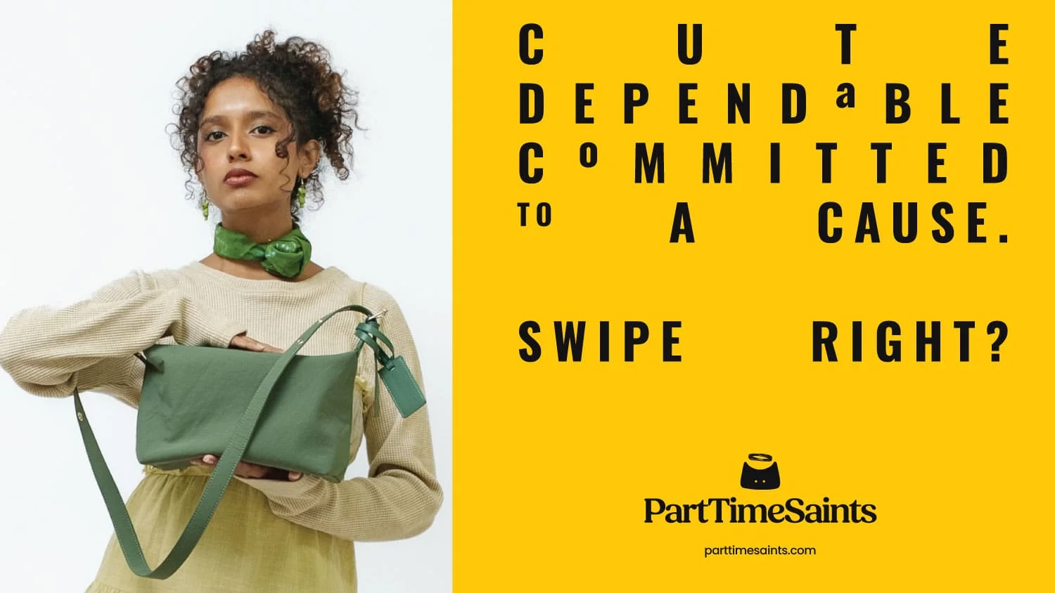
The Brand Positioning: Style without the sermon
The research revealed something important. Our audience cared about sustainability, but they didn’t want it to feel heavy, moralistic or overly serious.
Sustainability was never meant to feel like a rulebook. It needed to feel effortless. That kernel of truth shaped the brand’s positioning:
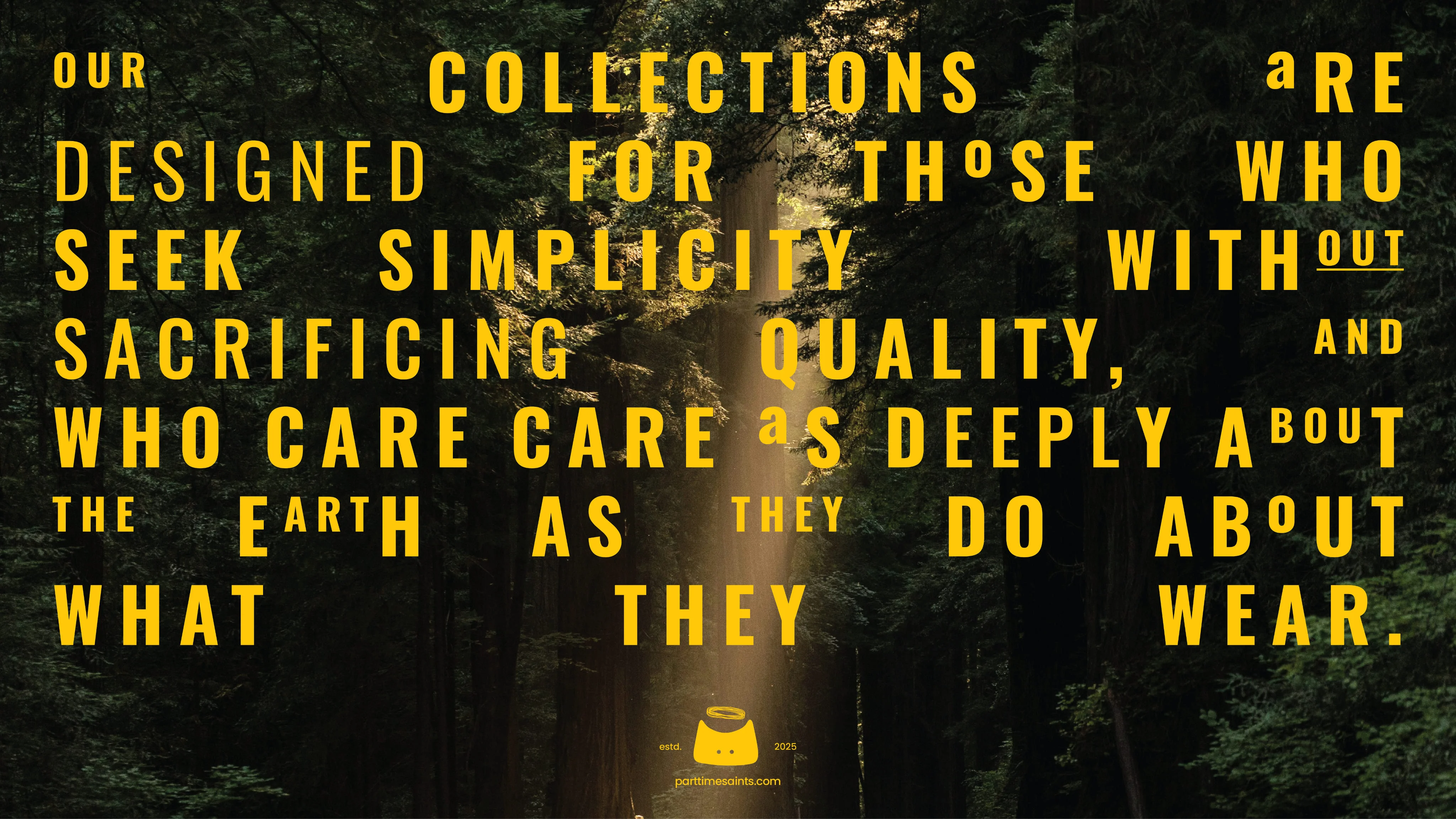
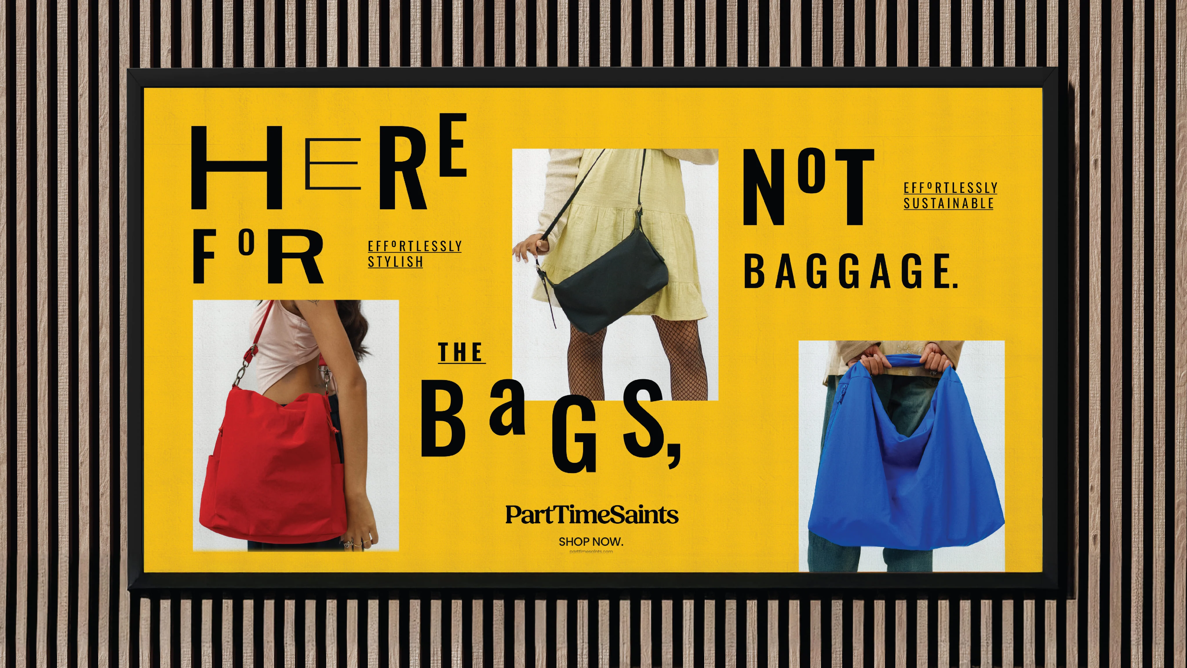
EFFORTLESS STYLE, EFFORTLESS SUSTAINABILITY.
The Brand Name: Mischief, meet meaning.
The brand wasn’t asking for perfect behaviour. It started with a simple insight about human nature most of us already know: no one gets it right all the time. But that rarely stops us from trying to do the right thing when we can.
That thought shaped the brand strategy. From dozens of explored names, one stood out immediately.
PART TIME SAINTS
It is honest, slightly cheeky and even a little rebellious. And, it opened up a world for the brand to be built around.
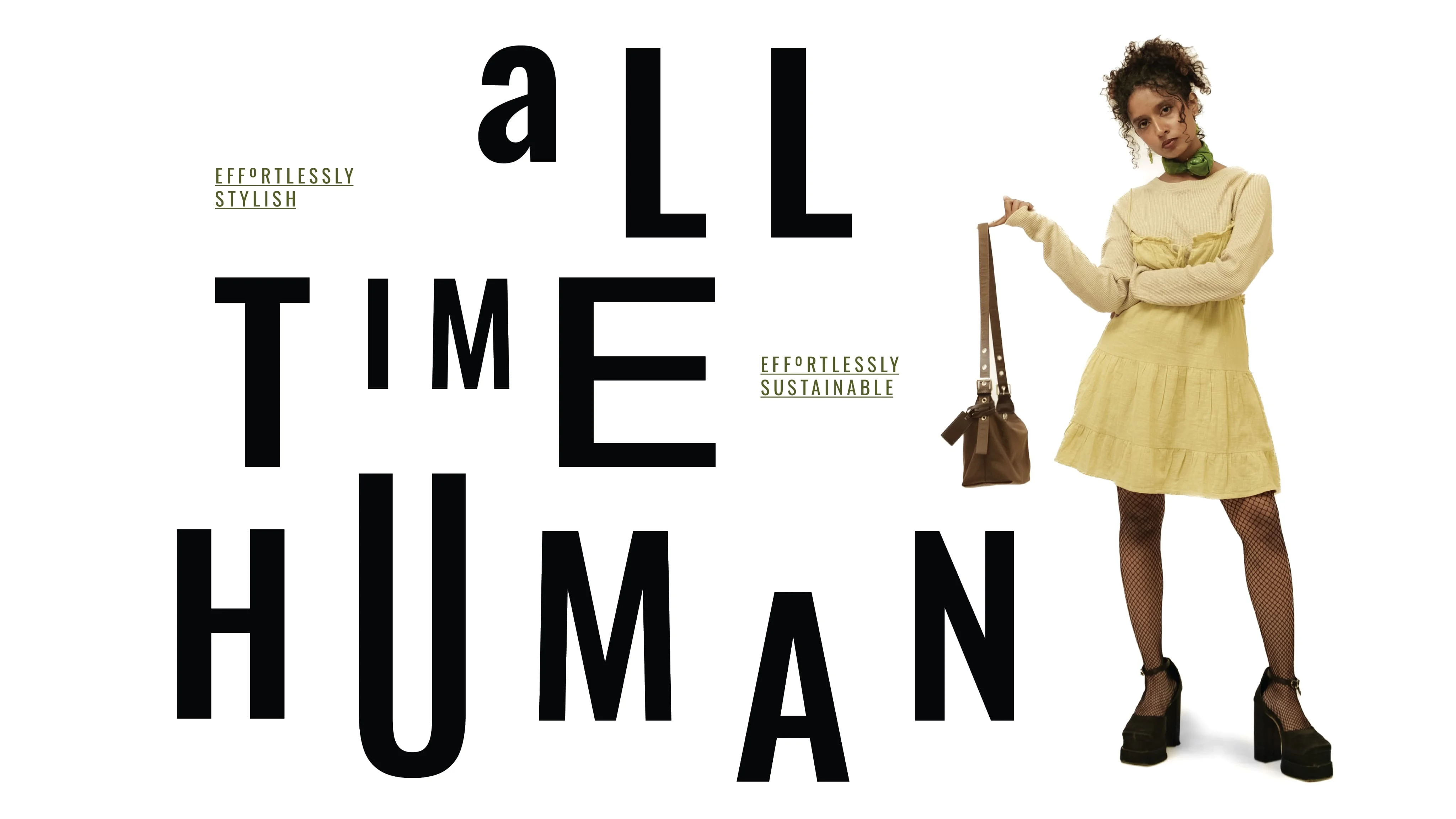
The Brand Tagline: The line that made it click.
The name shaped the brand’s personality almost instantly. It opened the door to excitement rooted in sincerity, and a tone that was youthful, slightly mischievous and always relatable. The brand could talk about responsibility without sounding moralistic.
With the personality in place, all the brand needed was a tagline that brought the idea full circle:
PART TIME SAINTS
All time human.
If the name speaks to the moments we try to do better, the tagline reminds us that we are human first.
The Visual Identity:
The brand believed in saints who occasionally bend the rules; the identity needed to capture that spirit, too. And a little mischief wouldn’t hurt either.
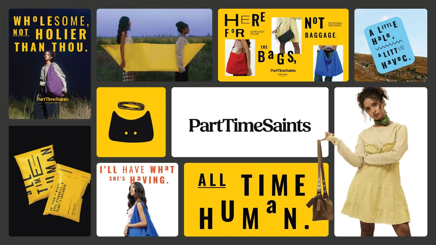
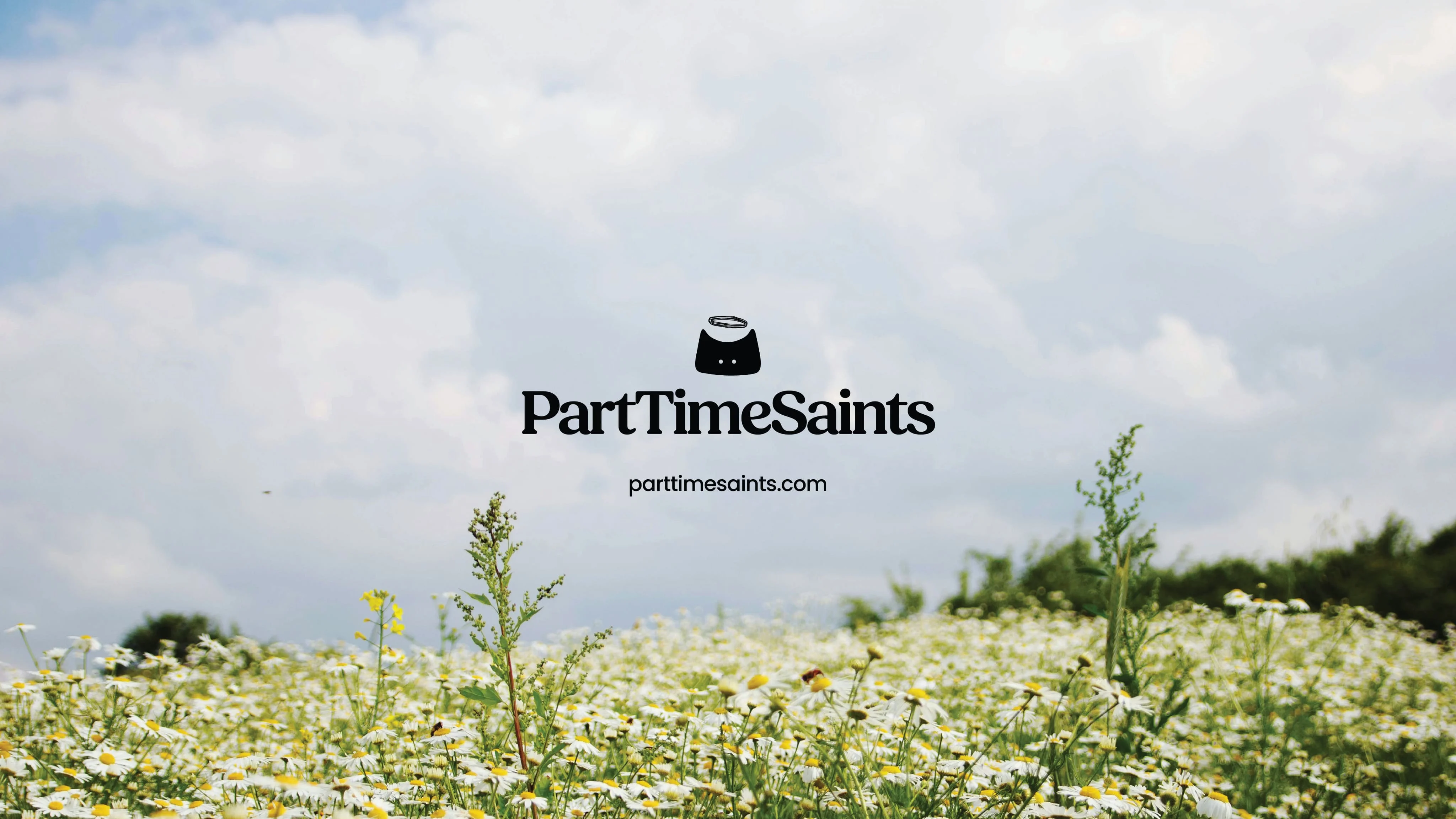
The Logo Mark: Saintly… but not too saintly.
The icon is a black cat with a halo. Cats have a reputation for being curious, slightly mischievous, and occasionally ignoring the rules entirely. Yet, people adore them anyway. Add the halo and the balance appears - the “saint” to the cat’s natural instinct to misbehave.
The cat’s form also mirrors the shape of a bag - a nod to the brand’s hero product.
The Wordmark: Polished, but never rigid
The wordmark leans into a refined serif, chosen for its timeless, fashion-forward presence. Softened corners and gentle curves bring warmth into the letterforms, placing the wordmark comfortably within the world of lifestyle and fashion.
On Colour: Breaking the beige (and green) barrier
Part Time Saints had other plans than to show up in earthy greens, soft browns and a shade of well-behaved beige.
At the heart of the palette sits Saintish Yellow paired with Black - a bold and vibrant combination that is playful enough for the Hip Teen and polished enough for the Working Grad.
The supporting cast of brighter colours takes the palette out of the predictable eco zone and into an unapologetically expressive world.
Typography: A dynamic system made for play
We chose Oswald and Poppins as the core pairing - two typefaces that are clean, contemporary and highly versatile, to give the brand the flexibility to move across digital, retail and editorial environments.
Large headlines, unexpected scale shifts and slightly off-beat alignments introduced the right attitude and movement into the layouts.
On social media, the typography can stack, stretch and experiment with composition for layouts that match the rhythm of the platform.
On the website and in more functional spaces, the compositions breathe a little more, leaning editorial while still retaining their character.
The system flexes and bends to fit every context, but no matter where it shows up, it’s unmistakably Part Time Saints.
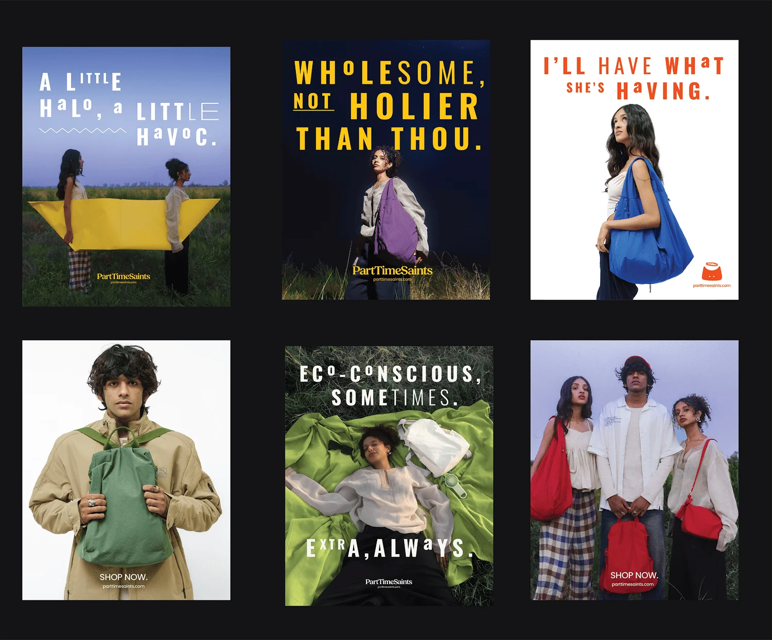
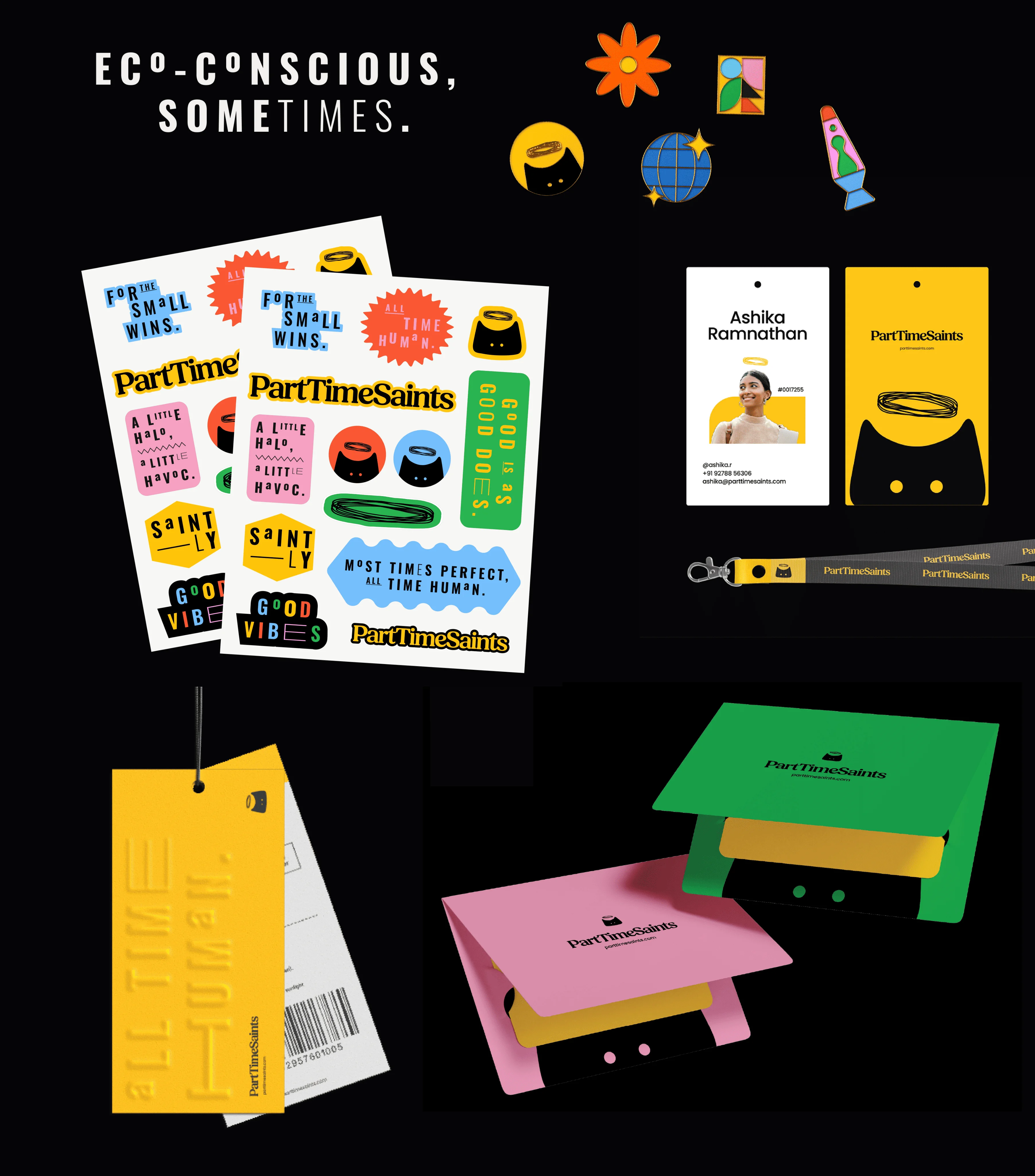
Building the brand world: Saints, sinners and some very good stickers
From badges, stickers and custom icons to packaging details, every application of the visual identity adds personality while staying true to the brand’s core idea and personality.
The haloed cat appears throughout the ecosystem - sometimes front and centre, sometimes tucked quietly into the background. The bold colours keep the system playful and expressive, so the people carrying it can have just as much fun with it as we did designing it.
The Result:
The right story changes everything. When the strategy is rooted in truth and branding gives it form, the idea stops being just an idea. It becomes a brand people recognise, relate to, and want to buy from.
For EcoRight, that idea became Part Time Saints.
Interested in working together?